It started, as many Bowen stories do, over coffee with Ron Woodall.
In one of their monthly chats, several years ago, Gordon Ganong was telling the former Expo creative director and ad whiz about chairing a municipal committee seeking someone to create the Bowen brand. Woodall suggested getting in touch with a fellow who’d recently moved to the island.
Chris Staples is a heavy hitter in the advertising world and had worked with Woodall in the ’90s (in one 1999 Maclean’s article Woodall described Staples as “probably the best all-round advertising person I’ve seen in my life”). Rethink, the creative agency Staples co-founded in 1999, has counted WestJet, Molson Canadian, Heinz Ketchup and A&W among its clients. But the biggest brands in Canada didn’t hold a candle to Bowen Islanders.
“All of these things are a walk in the park compared to trying to get Bowen Island to accept the community brand,” said Staples – he and Rethink took on the project pro bono and the brand hit its fifth anniversary last month. “It was the toughest challenge I ever was involved with.
“You know Bowen – there’s many like-minded people, but they often have trouble agreeing on anything.”
June 27, 2016, the brand committee and Staples unveiled the brand to municipal council – and were met with laughter.
The tagline was never meant to be the focus of the brand: “Tell your friends it’s awful here.”
But it was the tagline that galvanized the island and propelled the brand to international media attention: Ad Week, Lonely Planet, CBC, the Globe and Mail, covered the tongue in cheek phrase and the island adopting it.
“There were people that loved it and there were people that hated it,” recalled Ganong. “It was pretty intense.”
But the thing was, the world wasn’t the intended audience – the intended audience was always Bowen Island. And to a degree, Staples was a victim of his own success. After the brand went viral, he had to face islanders.
“I think the biggest misconception is that people thought the brand was to get a bunch of tourists onto Bowen,” said Staples. “I got blamed so many times at cocktail parties – like look at what you’ve done, we’re overrun with tourists because of the Bowen brand.”
“The tourism is one small part of it, but there’s never been any serious money spent attracting tourists to Bowen,” said Staples. “What the brand was really supposed to do was be a true community brand that anyone could use, whether you’re a business or charity, or the municipal government, or just posting on Facebook.
“The brand is a lot more than just a few words. It’s kind of the look and feel, and personality of the island. And I think that’s really what’s endured,” said Staples.
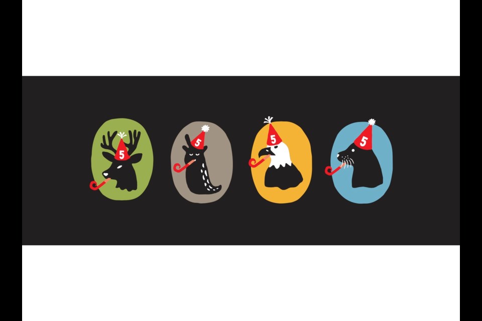
Five years on, the fun font and four mascots have eclipsed the contentious tagline.
Four mascots because one couldn’t do. “There’s no single image or mascot that could adequately represent the whole community,” said Staples. “We’re a village of different kinds of people.”
There’s the new agey slug, “chief advocate of island time” who’s into wellness. The eagle, who is all about protecting the environment and keeping an ‘eagle eye’ on things. There’s the seal, who’s all about fun and trying new things. Then there’s the deer – “proud and protective of our people, places and quirky culture” – or as Staples quipped, “a bit of a jerk and he’s salty.”
The deer, as the story goes, draws inspiration from Ron Woodall.
While Bowen Island Municipality does own the brand and plays a semi-gatekeeping function, the iconic Mr. Dodo font and four quirky mascots have seeped into Bowenia.
Sophie Idsinga, BIM’s communications coordinator, remembers sitting in the room when the brand was presented to council.
“I was surprised, but I was delightfully surprised. It’s such a Bowen thing,” said Idsinga. “It’s really worked itself out to be an identifier for our kind of unusual funky island.”
Day to day, Idsinga, is probably one of the most regular users of the Bowen brand. Part of her role is to try to ensure that anything going out publicly from the municipality has the brand applied to it – so there’s visual recognition and a standard across the municipality.
“I love the bold colours, and I find it really fun and easy to work with the assets,” she said, “and the mascots.” (For example, during the pandemic, the mascots donned masks.)
“We love trying to come up with puns and things that we can use,” she said. “As a municipality and a local government body, it’s fun to just break down and be more fun and human.
“That’s something that I really enjoy.”
Staples enjoys it too. “It makes me smile every time I open up the Undercurrent, and I see an ad for Chief Financial Officer, like a recruitment ad, and its Mr. Dodo, in the headline,” he laughed. “To me, what that says is, if you’re going to apply for a job on Bowen, you immediately get that this is a quirky place.”
That being said, it’s not all fun and games being a local government, and when there are serious communications, where the Mr. Dodo font wouldn’t be appropriate, Idsinga or staff use the more serious Larsseit font.
While the municipal brand marks aren’t for outside use, the colors, the fonts, the mascots are open for the community to use (they do have to sign an agreement that the brand won’t be used in a derogatory, offensive or discriminatory way and, if it’s being used for commercial purposes, pay a small fee).
And several community groups and members have embraced the brand.
Shortly after the brand unveiling, Tourism Bowen Island bought the Explore Bowen Island brochure and didn’t have any additional money. But, as the tourist-facing institution of Bowen, Staples was adamant that it should have the new look, said Murray Atherton, who chaired the board at the time. “He put his Rethink team to work with us and, at no charge, designed the entire publication utilizing the icons and sayings throughout the brochure,” said Atherton. “It caught on so well and we had to do a second run.”
“We can’t thank Chris and Rethink enough for everything they did for their new island home.”
Other community organizations, like the Bowen Island Health Centre Foundation or the Sluggers slopitch baseball team, have also taken on the brand. And then there’s the merchandise: Cocoa West’s chocolate Bowen slugs, disc golf discs, soaps, and more. (Staples has a full set of all of the merchandise.)
Artisan Square is the latest brand adopter.
“I saw the brand, I fell in love with it,” said Artisan Square strata president Joe Borrelli. When it came time to replace the signage in the square, Borrelli suggested adopting the brand.
As a commercial photographer, he knows Staples through business and took a chance and reached out to the islander. Staples was enthusiastic and did up some modified mascots for the signage, that won the strata members over. “He was just amazing,” said Borrelli. “And just to give that to the community, I was completely knocked out by his response to the whole thing.”
The new signage includes the ‘Welcome to Artisan Square’ sign and a series of smaller signs, pointing the way to the village and along the walkways, set to go up this month. “It just appeals to everybody – it appeals to kids and adults and doesn’t leave anybody out,” said Borrelli.
Five years on, the brand isn’t without its critics, particularly those who see its success as attracting overtourism to the island.
But for Staples, the brouhaha has died down and folks who once took to the Bowen Island Everything Else Facebook group to criticize the brand, now come up to him wearing t-shirts sporting the brand.
“It was tough. But now I look at it and I’m really glad that the whole committee persevered and we waited out the naysayers.
“I think the deer and the slug are having the last laugh, hopefully.”
The brand celebrates the uniqueness of Bowen, for Staples. “Now, immediately when you see that font, you see that black and white, you see one of the mascots, you just know, it’s Bowen,” he said. “And that really exceeded any expectations I had five years ago.”


